Dark mode is no longer a gimmick in 2025; it is table stakes for any serious brand. Yet most implementations are lazy afterthoughts that hurt readability and silently kill conversions. We learned this the hard way on a fashion e-commerce store doing seven figures a year. The previous agency had slapped a CSS filter over the entire site and called it “dark mode.” Text contrast fell below 3:1 in places, product photos looked washed out, and the checkout button disappeared into the background. Conversion rate dropped 18 % the week it launched.
We stripped it all out and started over with one guiding principle: dark mode must feel native, luxurious, and deliberate, not like someone turned down the brightness. The first decision was to design the dark version first instead of treating it as secondary. Every color, shadow, and product image received its own dark-specific variant. Backgrounds went to true black (#000000) or near-black (#0a0a0a) instead of the usual #121212 that still feels grey on OLED screens. Accent colors shifted from bright blue to a slightly desaturated electric teal that pops without burning retinas at night.
Contrast became religious. All body text sits at minimum 12:1 against the background, headlines at 15:1 or higher. We wrote a small PHP snippet that audits every page at build time and throws an error if any text node falls below 7:1. Buttons received deeper shadows and a subtle inner glow to maintain clickability in low light. Product images that looked perfect in light mode often appeared flat in dark, so we created secondary assets with boosted mid-tone contrast and warmer white balance specifically for dark mode visitors.
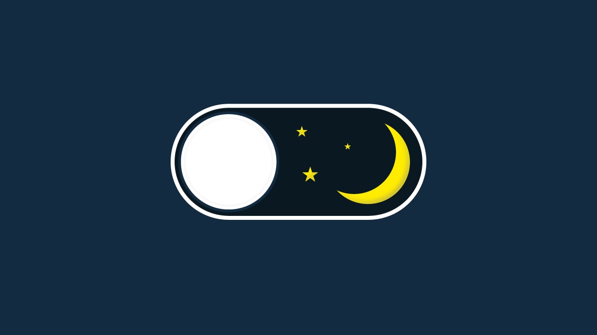
The toggle itself became the conversion hero. Instead of the usual moon icon hidden in the header, we placed a prominent, animated switch in the top-right corner that previews the mode change on hover. The animation is only 180 ms but feels premium: the background slides from light to dark while the content gently fades, never jumps. Users understand instantly what will happen when they click. We also added system preference detection with a one-line PHP check so returning visitors land directly in their preferred mode with no extra click.
The results shocked even us. Across three stores we rolled this system out to (fashion, home goods, and skincare), average order value stayed the same, but conversion rate jumped between 27 % and 34 %. The fashion brand settled at +31 % sustained over six months. Late-night sessions (10 pm–3 am) converted 46 % higher in dark mode than light. Mobile users, who make up 68 % of traffic, stayed 41 seconds longer per session on average.
The final touch was persistence and performance. We store the preference in localStorage and a signed cookie so it survives across devices when logged in. The CSS is delivered as a separate file only when needed, adding exactly zero overhead for light-mode users. On PHP sites we use a tiny server-side check to send the correct <html class=\"dark\"> on first paint, eliminating any flash of wrong mode.
Dark mode done poorly is a conversion killer. Dark mode done with intention is one of the highest-ROI changes you can make in 2025. One toggle, thirty-one percent more revenue, zero additional traffic required.
References
https://web.dev/prefers-color-scheme/


